Antistress Color: The Tone Of Calm
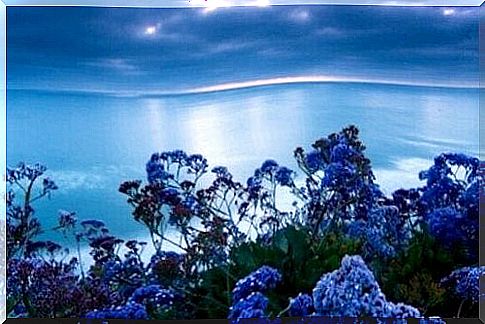
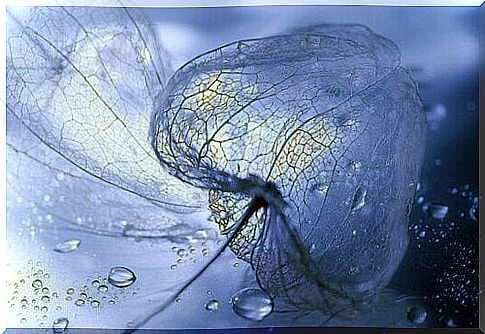
There is a color that reduces stress and brings calm. It is the hue that inhabits the sea and undulates in the oceans. It is the color of that clear sky on shimmering summer evenings and those clear autumn mornings. Thus blue, and all the situations in which it is the protagonist in its various shades, is the anti-stress color par excellence, creating a favorable context for relaxation and well-being.
Interestingly, although blue is one of the favorite colors of the general population, in the past it was not at all. This for a very simple reason: it did not abound. In addition to being the hue of the sky and the sea, it was not common to see it in the daily life of pre-12th century societies (except for Egyptian culture).
It was precisely in this century that thanks to new chemical and manufacturing techniques, blue went from a rather rare color to become part of religious paintings, family coats of arms and the works of the most excellent artists. From one day to the next, the population could experience the psychological and emotional impact associated with this tonality.
It was associated with divinity, mystical, royalty and elegance. In the 18th century and with the development of new pigments, a much wider range of blue appeared. With them and thanks to the studies of Michel Pastoureau, an undeniable reality became evident: blue was the favorite color of all Western countries. It was the tone that generated well-being and trust in the human being …
The anti-stress color
We have spent years studying the unknown world of color psychology with amazing results. What Newton himself started and Goethe later continued, was later developed in the books of Eva Heller. Nowadays, universities around the world analyze the relationship of color with the world of marketing and advertising or with the aim of creating more welcoming and at the same time more productive work environments.
Experts have known for many years that the antistress color par excellence is blue. This clear-cut conclusion can attract attention since, as we know, we tend to filter colors by associating unconscious contents with them.
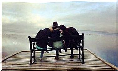
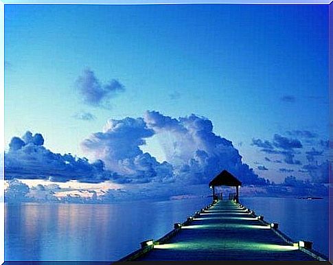
However, let’s try to change our minds for a moment. We try to evoke the sensation that it generates in us being in front of a calm sea, a sea of blue waters that melts on the horizon with a sky of the same color. If we reproduce the image well, the calm it emanates is immense, comforting, wonderful, a sensation that is experienced by most of the population.
On the other hand, scientists from the University of Granada (UGR) in collaboration with the Colegio de Educación Especial San Rafael in Granada have shown that blue light generates a very positive effect when the person experiences acute psychosocial stress (when discussing with someone, when working under pressure …). The blue color instills calmer than the white color.
Even in the studies carried out by Eva Heller it has been observed that the rooms or school environments in which blue predominates reduce the whims or behavioral problems in children. Its calming effect is undeniable.
The color blue: omnipresent
The anti-stress color is also the most popular color in the various brands. Many companies resort to blue because neuromarketing experts are well aware of the effects of this shade on our subconscious:
- Blue is not just visual, it is above all experiential.
- Generates confidence, tranquility, calm and order.
- Big brands like Facebook, Twitter, Ford, Volkswagen, IBM, Roche, BBVA, Carrefour or MRW use it because they know it conveys trust and loyalty.
Finally, there is no need to paint the whole house blue to achieve a constant calming effect. If we did, eventually we would get used to it and the brain would experience a kind of perceptual overload. The key is in balance, in knowing that when we have a bad day there is nothing better than a walk along the beach or lying in a park to let our gaze get lost in the immensity of the sky.
Blue, the anti-stress color, is always at hand and sometimes it is enough to look towards a window to unplug and immerse yourself in this magical shade.